New Walk Museum

Image

Fig 1. New Walk Museum http://www.contemporaryartsociety.org/wordpress/wp-content/uploads/originals/media/uploads/2010/02/3773/leicester-museum-mg-1099-jpg-827×550.jpg

I visited New Walk Museum (fig 1) On Wednesday 13th November 2013, and was a little disappointed by the standard of the museum and what it offers. I looked at the World Arts sector of the museum, and found that it was very limited, and that it wasn’t very big. I found that all of the pieces were placed very close together as well, and didn’t use the space available as well as it could. Unfortunately the Art Gallery was closed due to refurbishment, and this was extremely disappointing.

Image

Fig 2. Owl Vase http://www.leicester.gov.uk/your-council-services/lc/storyofleicester/cityheritage/peopleofleicester/lordrichardattenborough/

On the other hand, one part of the museum that I did quite like was Picasso’s Ceramics. I found the pieces very intriguing, and I particularly liked how Picasso managed to transfer his diverse and unique style onto ceramic vases and plates. I especially liked the owl vase shown in fig 2. I was amazed by the way Picasso managed to take an everyday, useful object and turn it into something quite quirky and unique. After visiting the museum I actually carried out further research, and found that Picasso did a lot of work with ceramics, especially vases and plates. Another piece of Picasso’s I really liked was ‘Dove’ shown in fig 3. Similarly I liked how Picasso used an everyday object to create a piece of art, but also I like how he uses complimentary colours to create beautiful patterns, and manages to give the piece its own personality.

Image

Fig 3. Dove by Pablo Picasso http://www.masterworksfineart.fr/inventory/picasso/original/picasso4791_2.jpg

Whilst I was at the museum, I also looked at the Space and Dinosaur exhibitions. I found these particularly engaging, and the electronic activities in the Dinosaur sector were particularly entertaining and interesting. The microscopes over the smaller pieces meant that you were able to look close up, and it was very interesting. Likewise I thought the space sector was particularly engaging with the electronic sounds and facts. Also the fact you can go underneath the pieces and pop your head up in a see through ‘bowl’, so you can see the pieces from a different angle.

Image

Fig 4. Dinosaur Sector at New Walk Museum http://farm9.staticflickr.com/8226/8495084381_4537e76922_o.jpg

Overall I would say that the New walk Museum in Leicester is not the best museum to go to if you are particularly interested in art, bearing in mind the art gallery was closed when I visited. However, if you like ceramics I would recommend going to look at Picasso’s ceramics as I found this particularly interesting. In addition the other sectors in the museum were more engaging and interesting, and there was a lot more ‘content’ to look at and was far more entertaining.

Word Count: 419

Bibliography:

ART FUND (2013) New Walk Museum and Art Gallery [WWW] Available from: http://www.artfund.org/what-to-see/museums-and-galleries/new-walk-museum-and-art-gallery [Accessed 15/11/2013]

LEICESTER CITY COUNCIL (2013) New Walk Museum and Art Gallery [WWW] Available from: http://www.leicester.gov.uk/your-council-services/lc/leicester-city-museums/museums/nwm-art-gallery [Accessed 15/11/2013]

PICASSO. P (2004) Picasso and Ceramics Hazan

Posted in Uncategorized | Leave a comment

John Lewis Christmas Advert

A new advertisement has just been released for John Lewis. It tells the touching story of a bear who has never experienced Christmas because he is always in hibernation, however, this particular year his friend the hare wakes him with a gift – an alarm clock.

1

Fig 1. Photograph from the shoot http://www.creativereview.co.uk/images/uploads/2013/11/p1000015_0.jpg

The advertisement is the first advert for John Lewis that uses 2D stop motion drawings on a 3D set. The music played in the advert is “Someone only we know”, a hit by Lily Allen in 2004. The Advert was created by Adam and Eve/DDB, the agency behind John Lewis’s advertising campaigns since 2009. It was directed by Elliot Dear from the production company Blinkink, and Yves Geleyn from Hornet. It features character designs by Disney artist Aaron Blaise, who has also worked on the Lion King and Brother Bear, among other films.

2

Fig 2. Drawing by Aaron Blaise http://www.creativereview.co.uk/images/uploads/2013/11/jl3_0.jpg

Aaron Blaise was said to have come up with the most amazing drawings almost immediately, as he has a very good understanding of animals from going to safaris and zoos and drawing them and seeing first-hand how they move. He had worked for Disney for 25 years before this advert, and this experience shines through his character designs.  It was said that the initial drawings had too much “Disney” and that needed to be stripped away to make the animals look more realistic. Features such as human eyebrows and pretty eyelashes had to be stripped away, as these would’ve not only made the designs more “Disney” but would’ve made the animals look more human-like, and unrealistic.

3

Fig 3. Photograph of John Lee building the set http://www.creativereview.co.uk/images/uploads/2013/11/img_2321_0.jpg

On the other hand, for the set design Dear suggests John Lee, a veteran model maker who has previously worked on sets for films such as Fantastic Mr Fox. He built all of the sets for the advertisement, and his close attention to detail meant that the sets were beautiful, and complimented the character designs by Blaise. All of the sets were made completely by hand, and in the photograph above you can see the process of John Lee building the sets.

45

Fig 4 and 5. Photographs of the front and back of drawings used in the shoot http://www.creativereview.co.uk/cr-blog/2013/november/behind-the-scenes-on-the-john-lewis-christmas-ad

In the picture above you can see the front and back of the drawings used in the shoot. Because 2D stop motion was used for the animation, it gave a really realistic effect in the finished advert and mixed with the music, light effects, set designs and most importantly the story behind the advertisement the team managed to create a beautiful advert.

Watch the John Lewis Advert here: http://www.youtube.com/watch?v=XqWig2WARb0

Word Count: 405

Bibliography:

BLAISE. A (2013) The Art of Aaron Blaise [WWW] Available from: http://aaronblaiseart.blogspot.co.uk/ [Accessed 11/11/2013]

CREATIVE REVIEW (2013) Ad of the Week: john Lewis Christmas Ad [WWW] Available from: http://www.creativereview.co.uk/cr-blog/2013/november/ad-of-the-week-john-lewis-christmas-ad [Accessed 11/11/2013]

CREATIVE REVIEW (2013) Behind the Scenes on the John Lewis Christmas Ad [WWW] Available from: http://www.creativereview.co.uk/cr-blog/2013/november/behind-the-scenes-on-the-john-lewis-christmas-ad [Accessed 11/11/2013]

SHAW. S (2008) Stop Motion: Craft Skills for Model Animation Focal Press; 2 edition

TERNAN.M (2013) Stop-Motion Animation: how to Make and Share Creative Videos Apple Press


Posted in Uncategorized | Leave a comment

Indian Hunter’s Coat

coat 3

Fig 1. Embroidered hunting coat (detail of 208) India, c.1630-40 http://collections.vam.ac.uk/item/O16066/hunting-coat-unknown/#

Fig 1. Shows an Islamic embroidered hunting coat manufactured in India. It was made for a man at the Mughal court in the first half of the seventeenth century, when textile pieces were made for luxurious domestic consumption and export. The embroidery uses silk thread on white satin, and it is displayed at the Victoria and Albert museum in London. What interests me about this piece in particular, is the way that the coloured silk thread embroidery is so delicate and detailed, and how the colours chosen blend together to create a beautiful and intricate design.

Image

Fig 3. Chain Stitch http://www.kreinik.com/shops/Chain-Stitch.html

The coat is embroidered with a fine chain stitch, with images of deer, rabbits, tigers, flowers, lions, trees and peacocks. The area around the neck is left plain, as a separate collar or tippet possibly of fur which may have been attached. The colours used are blue, yellow, and green, gold and brown which represent wealth as they are rich and relatively bright. The chain stitch embroidery was associated with professional, male embroiderers of the Gujarati Mochi community, who were employed to embroider garments and hangings for the Mughal court, as well as for export to the West.

Image

Fig 3. Back of hunters coat http://www.vam.ac.uk/content/articles/t/a-teachers-resource-using-the-v-and-a-at-key-stages-1-and-2/

In the mid seventeenth century, Raw silk and silk velvets and brocades were major exports to Europe from Safavid Iran. Textiles and textures like the embroidered riding coat in fig 1. Indicate wealth, which was and is very important to Islamic people. The piece reflects Islamic culture, and is a typical style in the 17th century Middle Eastern design. It is very different to designs in both Europe and America, and it is cleverly composed and hand crafted. Islamic art is very unique as it portrays the meaning of things instead of just their physical form. The naturalistic form of the piece with the floral patterns and design is very significant as nature is an example of God’s design, and has religious connotations which are incredibly important in Islam.

Image

Fig 4. Front angled view of hunters coat http://www.vam.ac.uk/content/articles/i/quilting-introduction/

I think this piece not only shows wealth and luxury in monetary terms, but also reflects the luxury of nature and God’s creations through the use of animals, plants and flowers. The chain stitch works really well as it is intricate and allows for great detail, and I think the colours complement each other well to create a really beautiful piece. The piece inspires me, because it is a great example of how both identity and ethics are incorporated into design. Just by the look of this piece, you can instantly tell it is Indian. This is because by the pure nature of the stitching and the detail used, the Islamic designers have created their own identity. I really like how the type of stitching used, and the colour of both the fabric and the silk thread works together to create a beautiful piece of design. This identity is also demonstrated in Islamic type, and in other pieces of islamic design.

Bibliography:

BLAIR, S. and BLOOM, J. (1997) Islamic Arts: Phaidon Press Limited 1997

BREND. B (1991) Islamic Art: British Museum Press

http://www.vam.ac.uk/content/articles/t/a-teachers-resource-using-the-v-and-a-at-key-stages-1-and-2/

http://collections.vam.ac.uk/item/O16066/hunting-coat-unknown/#

Posted in Uncategorized | Leave a comment

Mimmo Rotella

Mimmo Rotella

Image

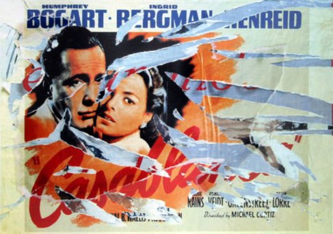
Fig 1. The poster of Casablanca in a décollage by Mimmo Rotella http://thisisavintagewall.files.wordpress.com/2012/05/mimmo-rotella-artwork-large-58242.jpg

Mimmo Rotella was a postwar artist. He was born on the 7th October 1918, and after finishing high school Rotella moved to Naples to begin art studies. Rotella moved to Rome to work at the “Ministry of post and telecommunications offices” however, he didn’t stay long as he was called to join the armed forces. In 1944, Rotella left the armed forces and went to naples art academy to achieve a diploma. Rotella moved back to Rome in 1945, and continued working as an artist. However, it wasn’t until 1953 when we saw the origin of what we now call décollage.

Image

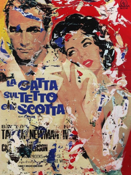
Fig 2. Décollage of the film: “Cat on a Hot Tin Roof”  http://thisisavintagewall.files.wordpress.com/2012/05/rotella.jpg?w=470

After having been to America and putting on his own exhibition, Mimmo Rotella wanted to create a new and unique way of creating art. He would take the posters off the street, and rip them up and stick them back on to a canvas. This is a very controversial way of working, as he ripped the posters designed by other people, and therefore he could’ve been seen as destroying their work. Posters using advertising try to create an identity, so the organisations and designers may have taken badly to Rotella tearing them and potentially destroying them.

Image

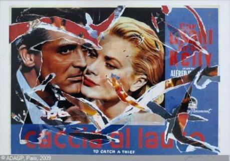
Fig. 3 Décollage “To Catch a Thief” http://thisisavintagewall.files.wordpress.com/2012/05/rotella-mimmo-1918-2006-italy-caccia-al-ladro-2138746.jpg?w=470

Rotella was soon named the “poster ripper”, or, the “painter of glued paper”. Not only would Rotella rip down the posters, but armed with a penknife he would take some of the zinc or metal sheeting from the metal frames on the billboards at night.  What I found particularly interesting about Mimmo Rotella’s work, is that although he tears apart existing work and glues it back together, it seems to make an entire new composition. The tears on the canvas look strategically placed, and I think that the unusual method that Rotella uses to create imagery is very successful. His work is incredibly striking, and has a unique style. I really like how the type and imagery on the posters are so striking, and the retro designs help to give Rotella’s work a lot of character.

Image

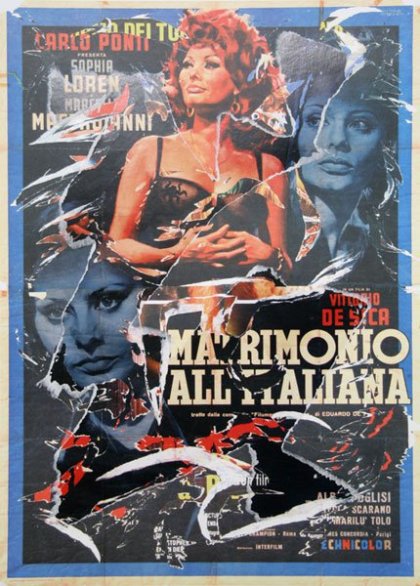
Fig 4. Décollage “Marriage Italian Style”, 2004 http://thisisavintagewall.files.wordpress.com/2012/05/rotella-matrimonio.jpg?w=470

In his work, Rotella deliberately goes against any rules of design, and creates a great impact. His choice of colours and/or posters work really well together, and they complement each other nicely. I particularly like “The poster of Casablanca” shown in fig 1. The people in the photograph clearly represent love, and I think that by tearing the poster in that way, the composition has a deeper meaning and it shows that love can be torn, and it is not always what it seems. Rotella passed away 8th January 2006, however, his controversial and visually striking way of working will live on for a long time.

Bibliography:

Celant. G (2007) Mimmo Rotella: Selected Works. Skira; First Edition edition

Heskett, J. (2005) Design: a very short introduction. Oxford: Oxford University Press.

http://www.rogallery.com/Rotella_Mimmo/rotella-biography.htm

http://thisisavintagewall.wordpress.com/2012/05/23/lo-strappamanifesti-mimmo-rotella-decollages-cinematografici/

http://www.britannica.com/EBchecked/topic/1240406/Mimmo-Rotella

Posted in Uncategorized | Leave a comment

My Approach to Graphic Design

I have never really thought of beyond university, and what I want to do after I graduate. I have always known that I wanted to go into Graphic Design, but I have never thought about which specific area I would like to go into, or, what type of job I would like in the future.

clash

Fig 1. CLASH Logo http://www.clashgroup.org.uk/wp-content/uploads/2013/05/clash-logo.jpg

After taking some time to think about this, I decided that I would like to use Graphic Design to raise awareness about common issues in our society today, which are perhaps not as dominant as they need to be. I applied for a voluntary job as a Graphic Designer at CLASH, which would fit around my studies. CLASH are an organisation that are trying to raise awareness about arthritis, and offer support and classes for people that suffer with the illness. My role is to raise awareness about CLASH around De Montfort University, and to promote what they are trying to achieve through designing posters and flyers. In addition, I will be designing their quarterly newsletter. This voluntary job is helping me to get an insight into what I may want to do after university, and helping me to practice the skills that I am developing whilst I am still learning.

ethics


Fig 2. Ethics scale image http://drkathleenyoung.files.wordpress.com/2010/10/ethics1.jpg?w=640

CLASH and other charities and organisations, have managed to build up their own identities. Therefore, any work that you do for that organisation will have an effect on how people view it. In my opinion, it is important to consider both the organisations identity and ethics, and how they would like to be perceived by their target market. When designing publications for them, you do not want to offend their target audience, or promote the organisation in a bad light as it could create issues for both you (the designer) and the organisation in the future.

benetton

Fig 3. Benetton campaign by Toscani http://agonistica.com/wp-content/uploads/2013/08/oliviero-toscani-022.jpg

A designer who has stretched these rules, is Oliviero Toscani. Toscani did work for the Benneton campaign during the late 20th Century, and he used shocking imagery for a range of campaigns that caused a lot of controversy, and stretched the ethnic boundaries in graphic design. His work uses controversial photography that I think ignore ethics completely, and would possibly make people dislike the organisation and what they stand for. In addition, this was when people re-evaluated the power and significance of advertising, and the effects that it has on people. Looking at Tocscani’s work now, I find some of it extremely offensive, and by looking at it I can see the importance of both identity and ethics in design today. I hope to carry this knowledge with me, through my career as a Graphic designer.

Bibliography:

Heller, S. (2003) The meanings of type. The back-stories, informed by trends, cults, philosophies and nationhood. Eye The International Review of Graphic Design, vol. 13, 50: 40-47.

http://www.eyemagazine.com/feature.php?id=98&fid=485)

Heskett, J. (2005) Design: a very short introduction. Oxford: Oxford University Press.

Roberts, Lucienne (2006) Good: an Introduction to Ethics in Graphic Design. Lausanne: AVA Publishing.

Posted in Uncategorized | Leave a comment